


Rating Rate Plans
Sixth Grade Poster Problem:Expression and Equations
Students learn how to describe cell phone rate plans using symbolic expressions. Also, students interpret expressions explaining the rate plans of three fictional cell phone companies and make recommendations about which is the best for certain users.
Downloadable Materials
There is also a bit misleading advertising thrown into this problem for fun!
Learning Objectives:
- Interpret and translate real-world situations into numerical expressions using variables.
- Write and evaluate numerical expressions involving whole-number exponents, variables, and specific values.
- Evaluate expressions with various values of their variables utilizing the Order of Operations.
Common Core State Standards for Mathematics:
- 6.EE.A.1, 2a, 2c
1. LAUNCH
Engage students in a discussion about cell phones, text usage, voice usage and rate plans. You will want to lead the discussion to elicit ideas about:
- Per-text or per-minute charges
- Flat rate charges for a fixed number of text messages or call minutes per month.
- Overages and other additional charges and fees
Ask the students to analyze a sample bill (Handout 1). Discuss cellular charges for text and voice calls. Guide students through the sample bill to understand and identify:
- What is the “billing cycle?”
- How many minutes did this person use for calls? How were the charges calculated?
- How many text messages were sent and received? How were the charges calculated?
- How would you describe the type of plan this person has? Unlimited? Pay-as-you-go? Other?
In your opinion, is the bill expensive or not very expensive? Explain.
Also, consider a discussion to help students think about how realistic numbers might be. For example, ask, “Suppose you got a bill with 1000 texts for a month. Is that realistic? Is it even possible?” [ Yes. 1000÷30 is about 33. And some people easily send 33 texts a day. ]
2. POSE A PROBLEM
Show Slide #1.
This phase of the lesson gets students accustomed to using algebraic expressions to compare monthly rate plans.
Help students determine the meaning of m (number of minutes) and t (number of texts). Working together, put in sample values for the variables to better understand the formulas. For example, you could determine how much Mobile Services, Inc. would charge for 1,000 minutes and 500 texts.
You will want to focus on how the formula is more complex when the user exceeds the “base” number of minutes or text messages. This concept should be familiar, however students are unlikely to have seen it expressed as a formula.
Use Handout #2
to give individuals or pairs of students practice at determining monthly costs for four sample customers with Mobile Services, Inc. rates.
Handout #2 Answer Key
3. WORKSHOP
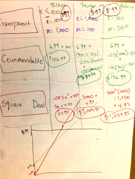
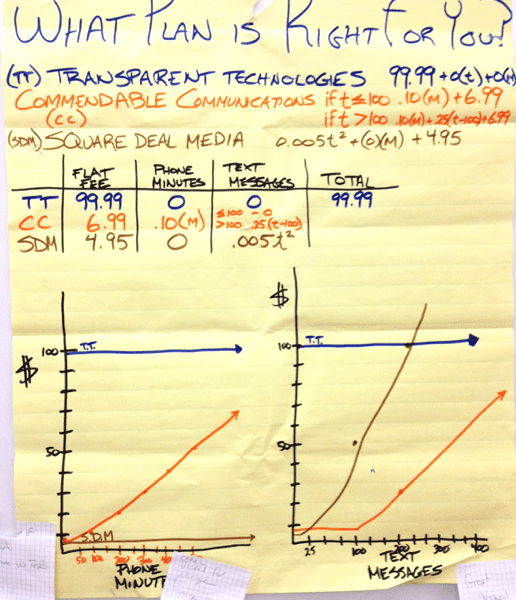
Show Slide #2. Ask, “What can we determine about Transparent Technologies’ rate plan?”
Note: This company uses a flat fee (unlimited use). The monthly bill is always $99.99.
Show Slide #3. Ask, “What can we determine about Commendable Communications’ rate plan?”
Note: This company uses a fee structure that always charges $.10 per minute for voice and begins charging for individual text messages after 100. They also add a $6.99 fee each month.
Show Slide #4. Ask, “What can we determine about Transparent Technologies’ rate plan?”
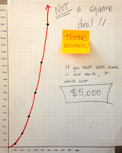
Note: This company indeed offers the first text for the only half a penny; however, the cost of numerous texts would be astronomical due to the exponent in the formula. (For fun, let students discover the effect of the exponent on their own before you explain it to them).
Each company makes a claim that may be true on the surface. But once the students analyze how each company determines their monthly fees, these claims may or may not hold up.
Show Slide #5. Challenge students: “Create a display that analyzes the rate plans and compares the three companies. Be sure to include examples of what the charges would be for a variety of customers. Some might text more, talk for more minutes, etc. Your poster should help someone understand which rate plan would be the best choice for them.”
4. POST, SHARE, COMMENT
Have students post their posters around the classroom.
Encourage students to travel around to view the posters created by other groups. Students should be encouraged to pose questions to other groups by attaching a small adhesive notes to their posters.
During this time, the teacher should be review all the posters and consider which to highlight during Phase 5.

5. STRATEGIC TEACHER-LED DISCUSSION
Facilitate a discussion about why the “best plan” for a user depends on that particular person's calling and texting habits. Select a sequence of posters to use during the teacher-led discussion that will help move all students from their current thinking (often Levels 1–3 below) up to Level 4 or 5.
Level 1: Calculations show final results but don’t show how the student got there. In particular, the work may not yet connect the algebraic expressions to each company's billing approach.
Level 2: Students makes generalizations with limited data. They do not reliably select sample customers to give a bigger picture.
Level 3: Students coordinate both the voice and messaging charges and intentionally create sample customers to highlight how changing the voice minutes and text messages change the final bill.
Level 4: Students use multiple representations to illustrate break-even points and how particular patterns of use affect the bill.
Level 5: Patterns, relationships, and well-articulated caveats are explained with mathematics. Students articulate the absurdity of using an exponent in a rate plan. They demonstrate visually how dramatic (and Draconian) its increases are.
Additional advances in mathematical thinking to press for during the discussion:
We use variables in different ways. One traditional type of algebra problem presents students with an equation to solve, such as 2x + 3 = 7. The student learns to “isolate” x to solve the equation, and get the answer, x = 2.
In this activity, however, we don’t need to solve equations. Instead, we present students with expressions that contain variables. The students have to find and compare the values of these expressions (the total monthly cost) for different values of the variables (the number of minutes and texts). The students do more plugging in than solving—but it’s “plugging with a purpose”: the expressions describe something real (the rate plans) using symbolic mathematics, and the students try different values in order to uncover the patterns behind the mathematical expressions. The underlying purpose is to find the best plan, where “best” depends on how you use your phone.
Key idea: A variable is a letter that can take on different values within a particular expression, equation, or situation.
A graph shows us, visually, the relationship between two quantities. Traditionally, the dependent or response variable goes on the vertical axis, and we often label it “y.” The independent or predictor variable goes on the horizontal (“x”) axis.
But what do you do when you have two predictors (in this activity, talk minutes and texts)? One strategy is to hold one variable constant. For example, you could make a graph of how the cost depends on the number of texts, given that you talk for 500 minutes. (See Poster D at Step 4.)
Key Idea: 2-D graphs show relationships between two variables. With some creativity, however, you can explore three or more variables, as long as you look at only two at a time.
6. FOCUS PROBLEM: Same Content in a New Context
Display Slide #6.
Ask students to turn and talk to a partner to become familiar with the table.
Ask several students to share information that they noticed.
- Food truck and restaurant prices differ.
- All the prices within a category are the same at each location.
At the close of the strategic teacher-led discussion with the students, distribute Handout #3 to help determine whether students can use their experience with the rate plans to formulate an algebraic expression for the total amount a family would pay at their favorite eatery.
Handout 3 Answer Key
Project funding provided by The William and Flora Hewlett Foundation and S.D. Bechtel Jr. Foundation.

This work is licensed under a Creative Commons Attribution-NonCommercial-ShareAlike 4.0 International License.